
Marvel Comics and DC Comics have long been the main influencers when it comes to the art and business of creating comics. These two companies have gone to absurd lengths to control their medium’s iconography (i.e., in the 1960s Marvel and DC jointly established trademark ownership of the term “superhero”). Few things are more subversive than a famous product logo visually destroyed. Attach that disfigured logo to the narrative deconstruction of an archetype and you’ve got a multi-layered symbolism that illuminates much more than over-hyped commercial art. With perverse irony, some of the boldest examples of this were published by Marvel and DC in their own books.
The Flash 335 (DC Comics; cover art by Carmine Infantino & Klaus Janson—July 1984): For lovers of stereotypical superhero fare, Cary Bates’ story in this issue will be a big disappointment. For adventurous genre fans and everyone else, it’s a blast of high drama and dark comedy. Plot elements that dominate: a sensory deprivation tank; The Flash’s hateful lawyer and the disrespect she displays for her super-powered client; The Flash committing random acts of vandalism on live TV and then freestyle skateboarding with a bunch of juvenile delinquent trespassers in the prohibited area of hydro-electric dam. And it gets worse: the elderly curator of Central City’s official Flash Museum is driven to tears by insulting media reports on the disgraced hero’s misconduct. The issue abruptly ends with series of graphic panels depicting a broken bloody hand sticking out from under a giant pile of boulders. “Failure” describes this chapter of The Scarlet Speedster’s life. The cover art of this issue depicts an angry irrational Flash slugging the hell out of his own logo at full speed.
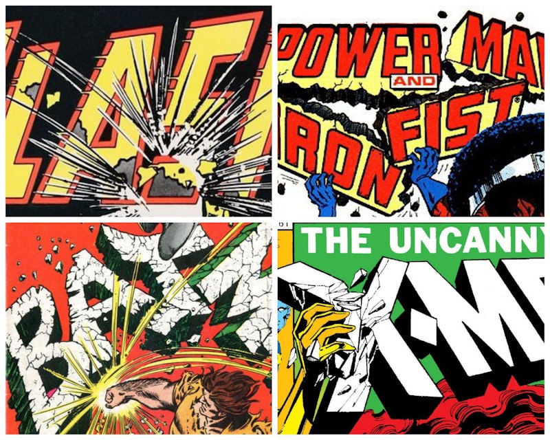
Power Man And Iron Fist 111 (Marvel Comics; cover art by Billy Graham—November 1984): By the time writer Christopher Priest (aka Jim Owsley) took over this title, its eponymous characters had gone through many changes, story lines, and phases. The strongest influence on the title’s 1980s incarnation was Mary Jo Duffy, the writer who helmed the series from 1979-1982. Her ebullient scripts gave Power Man & Iron Fist a distinct sense of humor that turned the Heroes For Hire into a super-powered “Kirk & Spock”-team (with Power Man as a no-nonsense streetwise “Kirk” and the interdimensional alien Iron Fist a naive but nerdy “Spock”). No. 111 kicked off Priest’s tenure, a run that added stranger political and philosophical edges to Duffy’s innovation. The issue follows unintentional super villain Captain Hero’s disastrous attempts to find employment as a member of the Heroes for Hire staff. This character is much more complicated than he seems on the surface. The villain throws Power Man all across Manhattan Island like a super ball, Hostess cakes and other junk food make significant cameos, and the action is driven by a tragic family drama. Even though Billy Graham’s brutal cover art shows Captain Hero smashing the logo, it could be easily argued that Christopher Priest’s script is the biggest source of iconographic annihilation.
Batman 194 (DC Comics; cover art by Carmine Infantino & Murphy Anderson, lettering by Ira Schnapp; August 1967): 1960s Batman comics were hilarious camp fests that mirrored much of the wackiness found on ABC’s Batman TV series. The tone of Batman 194 was no exception, but its classic front cover (a frantic, logo crushing depiction of Hulk-esque villain Blockbuster) and the reverse psychology behind the cover story were radically original touches. In Justice League Of America 47 (September 1966), Blockbuster ends up in a battle with similar Hulk-ish fiend Solomon Grundy. The melee ends with one of the silliest comic book plot twists ever. The villain turns himself over to The Alfred Foundation for psychiatric observation. There he becomes more like a giant baby with super strength than any evil danger to society. Nonetheless, a destructive malevolence stirs deep within. This explodes in violent tantrums triggered whenever Blockbuster hears the name “Batman.” As soon as The Caped Crusader finds out about this a complex plan is devised to pacify the behemoth, a plan which turns Batman’s superhero image inside out. For a 12-page story with next to no characterization, writer Gardner Fox’s “The Blockbuster Goes Bat-Mad” packs as many twists as it can into a tightly wound adventure based around the idea that head games and little white lies can be just as heroic as any death-defying act of bravery.
X-Men 135 (Marvel Comics; cover art by John Byrne & Terry Austin, lettering by Jim Novak—July 1980): From this issue on The X-Men would be driven ever deeper into an angst ridden sci-fi soap opera, a dramatic change that occurred at the peak of The Dark Phoenix Saga. This anti-heroic meltdown has been an influence on fantasy-driven media since it debuted. The issue’s logo destruction was the ultimate symbol of a revolutionary narrative arc that forever shattered the boundaries of mainstream comic storytelling.