
In both the VHS and DVD eras of home video, a common message was displayed before many films: “THIS FILM HAS BEEN MODIFIED FROM ITS ORIGINAL FORMAT TO FIT YOUR TELEVISION SCREEN.” If you were around in the late-1980s and early-1990s, you may remember conversations and arguments about “letterboxing,” and you might’ve wondered why your tapes of Manhattan and Pulp Fiction had black bars at the top and bottom of the screen. When Ted Turner tried to make money colorizing old black and white movies—not just classics like My Man Godfrey and It’s a Wonderful Life, but anything in the vaults that Turner then owned—it wasn’t just the stars of those films that revolted. James Stewart and Kirk Douglas testified in Congress against colorization and for the preservation of films as they are; this was just a few years before Martin Scorsese, Steven Spielberg, George Lucas, and Francis Ford Coppola went on a media blitz about how important it is to properly preserve and store films. They’re not disposable, they’re not like newspapers, and they’re very easy to lose.
People still don’t get that. They understood colorization was bad, and were similarly appalled by high frame rate films (Gemini Man) and uncanny computer animation (The Polar Express, Cats); and it’s easy to understand, or at least explain, how easy it is for movies to become inaccessible (as negative or copy). But aspect ratios? Forget it. Despite the fact that televisions are bigger and cheaper than ever, a movie’s true shape is still a mystery to most people. This isn’t something insignificant: a partial destruction of the work, vandalization, just as pernicious as “motion smoothing” being the default setting on all televisions now. Apparently, most people don’t consciously notice it; but they know. You don’t have to know anything about cinematography or lighting for anamorphic widescreen to effect the way you receive a movie; films like After Hours and Uncut Gems give the audience anxiety attacks, and it’s not because of the plot—it’s how those films are composed, shot, and presented.
After Hours is in 1:85 aspect ratio, a shape that just about fills a modern television screen, save for slim, barely noticeable if you’re not looking black bars at the top and bottom of the frame. The European equivalent is 1:66, with slightly wider black bars on the left and right sides of the frame. Hollywood movies produced before 1953, and many foreign and independent films thereafter, are in 1:37 “Academy Ratio,” the Hollywood standard established after the introduction of sound (silent were generally in 1:19 aspect ratio), a standard that’s still often cropped to 1:33, a near square, perfect for the size of old televisions. Many films, however, are shot in widescreen; whether they’re anamorphic or flat is irrelevant to this issue. The standard widescreen aspect ratio is 2:35 or 2:39, and it is those films—Die Hard, Three Days of the Condor, and Uncut Gems—are still “too wide” for modern televisions. Unless people clear space in their homes for tennis court shaped TV’s, those black bars aren’t going away.
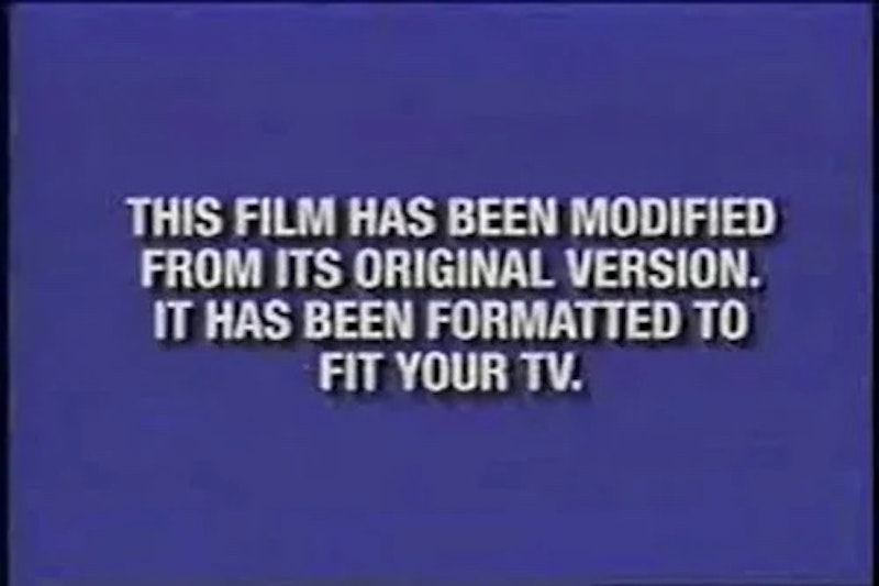
But they’re smaller than ever before, and the actual image, the movie, is legible now. Quentin Tarantino and Woody Allen had the power to insist that VHS copies of their films maintained their theatrical aspect ratio, but most didn’t, and most didn’t care, hence, This film has been modified from its original format to fit your television screen. In the DVD era, there were “Widescreen” and “Full Screen” editions of movies, sometimes separate products, sometimes on two sides of the same disc. People were still confused, but at least they were warned; now, what can you do? I watched Speed with my family last weekend. I hadn’t seen it in 20 years, and after seeing Die Hard in a packed theater earlier in the week, more Jan de Bont sounded just right. We put it on, streaming via Starz, and it was in 1:78 (an image that fills the screen completely). I thought it was strange, but it was his first movie as director, maybe he didn’t want to start off in anamorphic; then I saw the bloom, the blue lines that characterize all films shot in anamorphic widescreen, a visual distortion called “the cheapest special effect” by John McTiernan because “it makes every movie look more expensive.” So I looked up Speed’s “technical specs” on IMDB—something anyone with a computer or a smartphone can do—and found out it was in 2:39. Starz had cropped the movie without any note or warning.
Most people won’t care, won’t notice, and won’t understand why it matters at all. All I can say is that removing half of the frame is a destruction worse than motion smoothing, worse than colorization, because everyone can see those distortions. Once you point out motion smoothing to someone, they can’t unsee it; but a lot of people actually would prefer a version of Speed that loses the left and right sides of the frame so that they can have an image that fills their screen completely. None of this is new except the lack of any preface—if Gone With the Wind is going to have a “cultural sensitivity” warning on streaming, why not bring back that note, so ubiquitous in the 1990s and 2000s, that most people didn’t even read or understand in the first place? I answered my own question: people just don’t care.
—Follow Nicky Otis Smith on Twitter and Instagram: @nickyotissmith