
While departing Ohio last week, I was looking for a diner. When making a decision about where to eat breakfast in an unfamiliar place, I’ll always choose a local dive over a chain. I chose a place called “ORIGINAL PANCAKE HOUSE” in Cleveland, with chopped salami and eggs that were as delicious as the promise of their slanted vintage shouty caps.
I bet we all make decisions based simply on fonts. You don’t expect Garamond at an auto repair place, and you don’t want to see Curlz MT at an attorney-at-law. As a print editor for over 20 years, I saw the rise and fall in popularity of many fonts. Font choices tell stories of their own, relaying the personalities and styles of those who choose them. R. Chahal said “fonts are clothes for words,” and poorly dressed words can topple a magazine, a social media campaign, a brand.
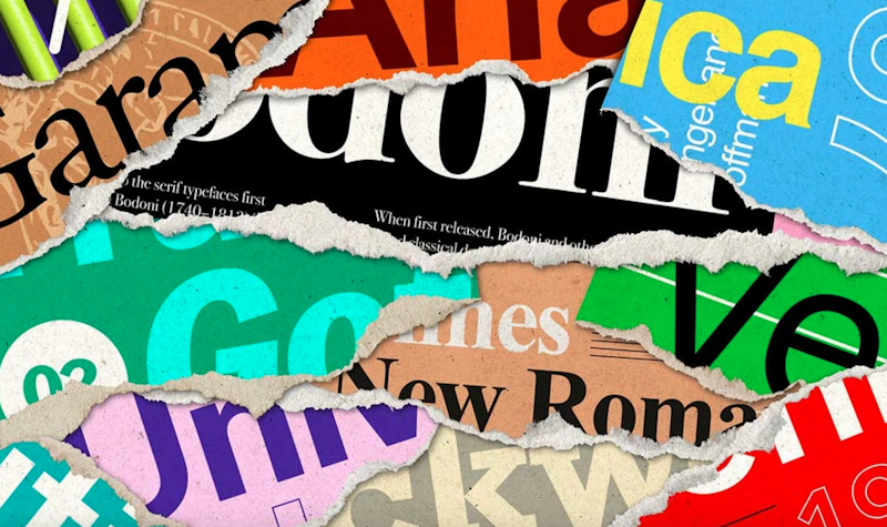
There are personalities for the fonts. Comedian Elle Cordova probably best captured this when she brought them to life in a short video series and Stephen Brower covered the fonts and if he would date them.
In a recent Thoughtlab article, Paul Kieran identified five fonts and their corresponding “personalities”:
1. Times New Roman – The Traditionalist
You’re a person of discipline, order, and quiet authority. Times New Roman is the font of choice for academia, official documents, and serious literature, and if this is your font of preference, you likely appreciate a structured and well-organized life. Dependable and pragmatic, you value intellect over trendiness.
2. Helvetica – The Modernist
Helvetica users are effortlessly stylish, drawn to minimalist aesthetics and modern design principles. If Helvetica is your font, you likely appreciate clean lines, open spaces, and the power of understatement. You’re a perfectionist with an eye for simplicity and an appreciation for good design, whether that’s in architecture, fashion, or a well-balanced cup of espresso.
3. Comic Sans – The Free Spirit
You don’t care for convention, and you certainly don’t take yourself too seriously. If Comic Sans is your font, you value fun, energy, and playfulness over rigid formality. Often associated with children's materials, classroom notices, and lighthearted communication, this font is a favorite of teachers, creative minds, and people who prefer an informal, friendly touch in their writing.
4. Courier New – The Nostalgic Thinker
If Courier New is your font of choice, you might have a love for vintage aesthetics, storytelling, and the written word. This typewriter-style font evokes an era of classic journalism, old Hollywood screenplays, and carefully typed letters sent by post. You may be drawn to nostalgia and find comfort in the past—whether it’s through vinyl records, black-and-white films, or a well-worn notebook.
5. Arial – The Pragmatist
Arial is the no-nonsense, get-things-done kind of font, and if it’s your choice, you likely embody that same practical mindset. Clean, readable, and straight to the point, Arial is used everywhere—from corporate reports to government documents—because it’s efficient, clear, and reliable. If you love Arial, you probably enjoy simplicity, organization, and a well-structured day.
I don’t disagree with these font horoscopes in general, and you can find out if you think your zodiac sign font is a match, but if you’re using Comic Sans unironically, it better be exclusively for an elementary school bake sale, period. It’s the most eyeroll font of all. Check out these AI-generated “emails from the fonts;” you know Calibri is all about task completion and progress reports.
There’s also a generational influence in font choices. Fonts carry a timeless influence. According to the Adobe blog, while Times New Roman is a Gen Z favorite, Baby Boomers feel that this classic font is the most outdated. Fonts send a message.
The word “font” isn’t even adequate as it’s a more modern derivative of the older and more appropriate concert of typography, and the impact it has on sight. “Figures are the most shocking things in the world. The prettiest little squiggles of black looked at in the right light and yet consider the blow they can give you upon the heart,” said H.G. Wells in The History of Mr. Polly.