
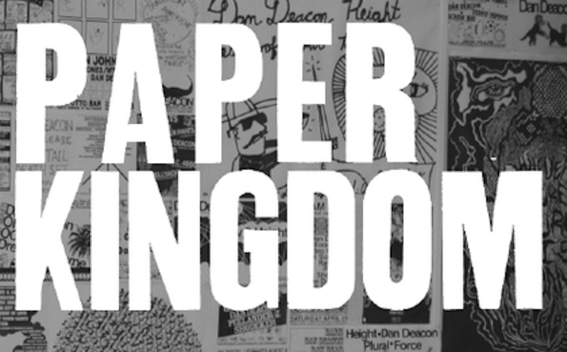
Walking around the Paper Kingdom exhibit at Baltimore’s Creative Alliance a couple of weeks ago I realized something: even with all the music blog downloading, the free promo CDs, the reading about new bands and upcoming albums, the hours of browsing at used record stores, I'm still a pretty sloppy music aficionado, listening to the songs and ignoring everything else. Paper Kingdom is Baltimore graphic artist Elena Johnston's retrospective of local music posters from the last 15 or so years, and though I remember going to some of the more recent concerts, I don't remember the posters—though I must have seen them. It got me thinking, I can't remember the last time I bought an album and looked at the artwork. Usually the CD goes in my car stereo and the CD case goes, well, somewhere under the back seat. I went through about 20 or 25 old CDs yesterday, The Magnetic Fields, Olivia Tremor Control, The Velvet Underground, etc., and was struck by some of the really beautiful artwork I had missed. Even my review last month of Sebadoh's expanded reissue of Bubble and Scrape makes only a brief mention of the band's genuinely beautiful collage and graphic pop artwork that's included. I only gave it the once over.
In Paper Kingdom, Johnston interviews Baltimore musicians and graphic artists like Dan Deacon, Victoria Legrand (Beach House), and Justin Lucas (Madagascar) about the design process and the connections they make between their music and their artwork. Like her previous book, La La Land, a collection of work by Baltimore artists who share a dark yet playful aesthetic, Paper Kingdom is a fascinating look at some under-appreciated artwork. Johnston herself designs music posters and t-shirts, and some of her more recent work can be seen on her blog. I contacted her recently via email.
SPLICE TODAY: Who were some of your earliest artistic influences? Were you drawn to graphic art from the beginning?
ELENA JOHNSTON: Some of my earliest artistic influences for my own body of illustration work were artists such as Toulouse Lautrec and Hans Hoffmann. I have always been drawn to graphic art that has roots in fine art.
ST: Can you talk about your experience at art school? What you studied, how it affected your art, and what you took away from formal training?
EJ: I planned on attending the Maryland Institute College of Art [MICA] to study photography, but when I started there I realized that drawing was much more challenging. Forms of art [that] are challenging are always a more worthwhile and satisfying experience, with the process and product. Warren Linn, a local illustrator and teacher, was very influential in my artistic development at MICA. He convinced me to study Illustration, which is graphic arts with a business sense. It was a lot of fun.

ST: How did your 2006 book, La La Land, came about? And how did you decide to include the artists that you did?
EJ: I realized that many of my contemporaries were making art that was influencing me as well, stylistically and conceptually. I decided to do La La Land as my senior Illustration project. So I started collecting work by my friends based on the concept of play. I realized how much I valued the idea of the "book" as a collection and documentation. I also felt like the works of these artists needed to be represented and put into the world somehow.
ST: What kept you working in Baltimore after you graduated from MICA, instead of moving to NYC or LA, for example?
EJ: After I graduated from MICA, I became friends with people outside of MICA who were/are in the music and art community in Baltimore. I designed a t-shirt for the band Beach House, and went on a U.S. tour with them as friend and merchandise girl. This experience gave me perspective about what I was doing in Baltimore. I moved to New York a month after the tour, lived there for six months, and then moved back last December. I realized that New York was not the place for me. The artistic community in Baltimore is much more tight-knit. I missed that, and in that I am inspired. I also felt strange when trying to work on a project that was Baltimore-based.
ST: Your new book, Paper Kingdom, collects Baltimore music posters going back 15 years or more. How did you find some of these older posters?
EJ: There were people in Baltimore that I met up with through the project that have lived here either their whole lives, or at least since the 1990s, that had collections and had been part of the music scene. I got a chance to talk to them about the history of the Baltimore music scene, for example their perspective of what was happening now in comparison to then. Two people in particular that had collections were Mike Apichella (Human Host, Charm City Suicides), and Tim Kabara. I also interviewed Apichella for the book, and he talks about these things in the interview.
ST: When did you first start making music posters and band t-shirts?
EJ: It was after I graduated from MICA. I did the t-shirt design for Beach House, and a few of their posters. I have also done posters for the local band Small Sur. That was how it began.
ST: What's the process for you? How do you work? And what makes a really good music poster, in your opinion?
EJ: I like to design a poster or t-shirt design with the intention of it being silkscreened. I would design something and then Jordan Bernier would silkscreen it. I never learned how to silkscreen, and Jordan prints his own posters, and some for other artists in Baltimore. I also like to do pen drawings with watercolor for posters.
I think a really good poster has to do with how the artist approaches a lot of things. To give a few examples....Type as image, representation of band's music, Process (silkscreened, letterpress, digital print), Color balance, simple vs. cryptic design. All of these things can make or break a poster. The majority of the posters in Paper Kingdom can stand on their own as an art object. This is important.

ST: Can you talk about a couple of your favorite posters in the book?
EJ: A few of my favorites were designed by Jordan Bernier. He uses a simple, folk aesthetic mixed with bright colors that often contrast each other. They are all screenprinted. My favorite of his was for Twig Harper. It was one of his first designs. There is a Beach House poster designed and printed by Whitney Simpkins. It is simple, ornate, and dreamy, like their music.
Justin Lucas' posters are usually flora and fauna based, and has made some of my favorites. And Shaun Flynn's are cryptic and complicated. He plays with the idea of type a lot, and hides the type in things such as hair, or complicated patterns.