
Why do so many movies have such boring title sequences? I’ve never understood why so much potential energy is wasted on title cards that say nothing. Sans-serif white on black is boring. Even worse is the hand-writing trend that began with Napoleon Dynamite in 2004 and hasn’t ebbed yet—I just watched a decent “finding your feet” rom-com called I Used to Go Here, shunted off to DVD and VOD sometime this year. Handwritten cursive over anything is an abomination.
To my mind, the only provocative and powerful use of an opening title card was in Joker, with those five letters in bright piss yellow completely filling the screen in all caps as Joaquin Phoenix danced down those now-famous stairs in the Bronx. Even more exciting was Claire Denis’ brutal premature running of the end credits over the final scene of her riotous Let the Sunshine In. Juliette Binoche is pouring her heart out to her therapist (Gerard Depardieu), and everything is as banal as what came before (the film has the astringent, antiseptic quality of a pharmaceutical commercial—it’s one of the funniest romantic comedies of the last 10 years). As Binoche goes on, Denis just starts the credits, undercutting the scene even further. Hurry along now, Juliette—there are more important stories to tell. This is a use of title cards that is sympathetic to the content of the film. This shouldn’t be so uncommon.
I should say that China, Japan, and South Korea have consistently recognized and used title cards in new ways, adding to the content of their films—I’m thinking of Sion Sono, Diao Yinan, Wong Kar-wai, and Hong Sang-soo, among others. It may sound silly to say that putting the title of the movie an hour in instead of five minutes in will make any substantial difference on the film, but it’s true. There are almost no popular American examples, except for The Departed, whose title card comes in about 24 minutes into the movie, completely out of place and nowhere near any other titles. This begs the question of the card’s context and if, perhaps, something can be gleaned from this phrase’s placement at a seemingly arbitrary place. That’s the kind of effect you can have, and it’s almost never used.
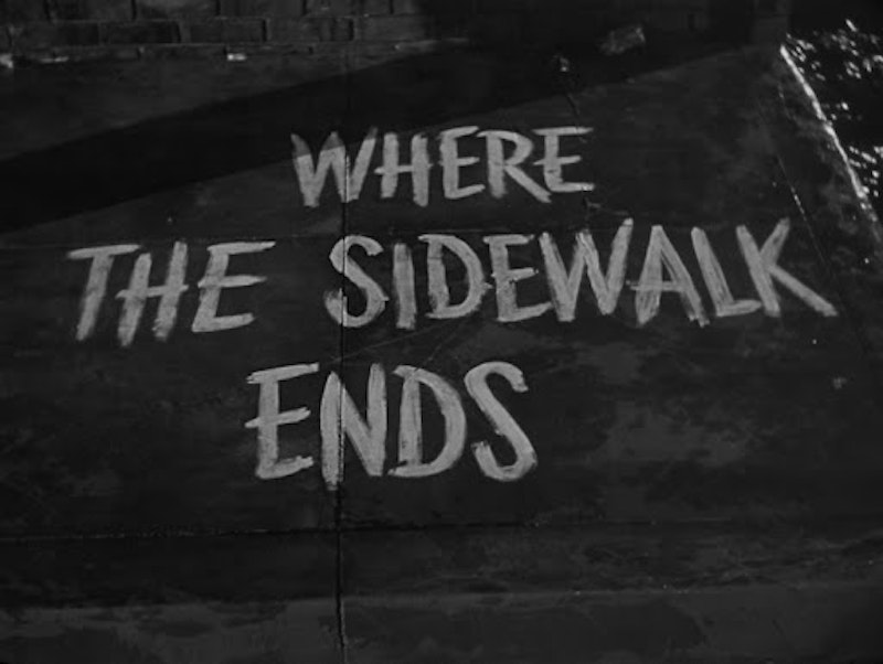
How many living graphic designers are you aware of for their movie title sequences? Saul Bass looms large and alone, although Otto Preminger did some good work without him in 1950 with the opening of Where the Sidewalk Ends. In Classic Hollywood, there’s pages turning, shadows on the wall, signposts, and other diegetic titles, but nothing like the way filmmakers across Europe’s various New Waves took titles seriously and incorporated them into the text of the film instead of mere introduction (think Rainer Werner Fassbinder’s credits flashing on and off in computer-green font against Peer Raben’s relentless rhythmic pulse; or Jean Luc-Godard’s joy in simply throwing words and letters up on a screen as images unto themselves, as in Weekend, Pierrot Le Fou, La Chinoise, and Vivre Sa Vie, among many others; even Claude Chabrol made a point of rolling his credits over an out of focus image after a cold open setting up the film).
I admire directors like Woody Allen and Hong Sang-soo that stick to one font, one piece of wrapping paper and go with it for years. Not every movie needs flying names and exploding titles, but it’s depressing to watch any movie and see text that looks laid out straight from an insurance catalogue. Apparently, the only alternative to Helvetica is cursive, the most indecisive and meek of all title sequence styles. It has been denuded of all meaning in the decade and a half since Napoleon Dynamite and Juno, a shortcut to “personal” or “quirky” or small-and-nice-and-easy—these are all great, but we need to find new ways to communicate them to viewers, potential or jaded.
—Follow Nicky Smith on Twitter: @nickyotissmith