
It’s now old news that Barack Obama’s pastor hates America. But since I am a staunch supporter of family values, true American patriotism, Toby Keith, and the sound the wind makes when it flits through high wheat plains, I must inform you of a new disturbing Obama relationship, the one between the candidate and his font designer, Eric Gill.
As the visual manifestation of everything a candidate stands for, a politician’s sign is an integral part of his/her campaign. The differences between Obama and Hillary Clinton’s campaign signs are worth noting.

Clinton’s wordmark aesthetically projects experience and tradition. The standard political colors (red, white, and blue) are in line with almost every pol’s campaign paraphernalia that has preceded hers. The thick lettered font with heavy serifs represents a visual attempt to establish a strong presence and sense of authority. Clinton’s political sign is nothing we haven’t seen before and complements her campaign’s message touting her strength.

Obama’s sign, on the other hand, is fresh and modern. The large “O” that’s been converted into a rising sun over a red-striped hill illustrates his relentless slogans of “Hope” and “Change.” Obama’s name is presented in thin, sleek lettering that commands a strong presence against a white background (think of all those Apple commercials), and coupled with the rising sun image, the sign is as visually progressive as the campaign presents his politics to be.
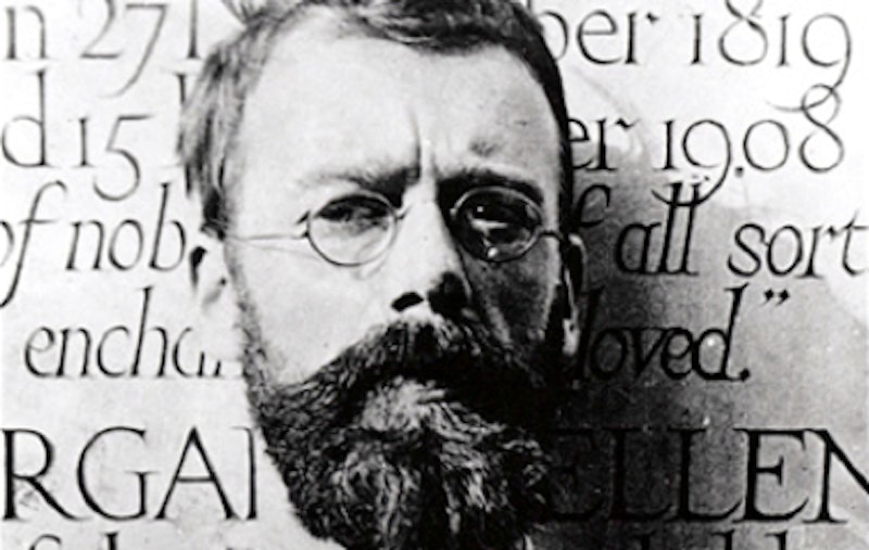
But the designer of the font used in Obama’s wordmark is far more controversial than even the Rev. Jeremiah Wright. The font, known as Perpetua, was designed by Eric Gill and released in 1929. Born in 1882 in Brighton Sussex, Gill was a British artist who was not only a typeface designer, but also a sculptor and a calligrapher.
Today, Gill is best known for his contributions to the field of typography. His most famous typeface is Gill Sans, a sans-serif typeface based on lapidary Roman capitals. Gill Sans was designed in 1927 and released in 1928. Modern day examples of Gill Sans can be seen in British Railways publications/advertisements, BBC advertisements, Saab, and the album cover for Thom Yorke’s The Eraser.
While Gill is frequently praised in the design world, recent examinations into his private life have revealed a number of disturbing details about the heralded typeface designer that the Eric Gill Society has refused to acknowledge or publish. In her 1989 biography of Gill, Fiona MacCarthy made public a number of his diary entries in which Gill provides detailed accounts of his adultery, sexual abuse directed to his own children, and numerous sexual encounters with their dog.
What message does Obama’s association with Gill send to the American public? Does Obama condone adultery, bestiality, and pedophilia? Everywhere I see Obama’s wordmark—on bumper stickers, pins, yard signs, and tattooed to the breasts of countless Young Democrats (male and female)—all I see is the erosion of moral values.
Writing for the Boston Globe, graphic designers Sam Berlow and Cyrus Highsmith stated that the tall lower-case letters in Clinton’s wordmark “reminds me of someone with their pants pulled up too high.” Well at least her wordmark doesn’t have its pants down chasing your adorable Labrador around the house.
Obama must address his affiliation with Eric Gill. A failure to do so will render Obama morally ambiguous and ultimately unelectable. In this election we all want change, but I only hope we can achieve it with our values secure and national integrity intact.